

cherish caledonia
a memorable appreciation
Cherish Caledonia is a heritage wellness and lifestyle brand rooted in themes of care, ritual and soft luxury. The brand exists to promote Scottish and Celtic cultures as part of the Celtic revival movement and highlight a modern take on culture but showcasing it continues to be shaped by the land, climate, craftsmanship and storytelling.
As a small business, the owner came to me looking to create a unique way of saying "thank you" to new customers.
a memorable
appreciation
Cherish Caledonia is a heritage wellness and lifestyle brand rooted in themes of care, ritual and soft luxury. The brand exists to promote Scottish and Celtic cultures as part of the Celtic revival movement and highlight a modern take on culture but showcasing it continues to be shaped by the land, climate, craftsmanship and storytelling.
As a small business, the owner came to me looking to create a unique way of saying "thank you" to new customers.
cherish caledonia
a postcard that is
tasteful and
intentional
The owner of Cherish Caledonia wanted a postcard design that had elements of tactile storytelling. The cards were to function as brand artifacts while feeling intentional and not overly promotional. One of the main goals were to evoke calm and nostalgia from the viewer, and trust with the brand that the representations of Scotland are being done faithfully.

a postcard that is tasteful and intentional
The owner of Cherish Caledonia wanted a postcard design that had elements of tactile storytelling. The cards were to function as brand artifacts while feeling intentional and not overly promotional. One of the main goals were to evoke calm and nostalgia from the viewer, and trust with the brand that the representations of Scotland are being done faithfully.
looking to the land
As the design process started and taking into deep account the brief, the direction of imagery was obvious. Scotland has such breathless landscapes and nature. To position Cherish Caledonia as elevated and of high quality, the imagery needed space to breath. Along with being a heritage wellness brand and in the home space, the beautiful airy landscapes mixed with traditional Scottish homes seemed like the perfect place to start.


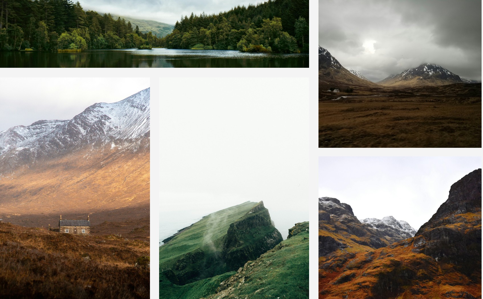
a look at design directions
I took four design directions to present as first drafts. Although all the options had strengths, some seemed to hit the mark more than others. What seemed to stick with the owner of Cherish Caledonia was the warmer tones and the playful nods and interactions between the small typography and the house imagery.

a look at design
directions
I took four design directions to present as first drafts. Although all the options had strengths, some seemed to hit the mark more than others. What seemed to stick with the owner of Cherish Caledonia was the warmer tones and the playful nods and interactions between the small typography and the house imagery.
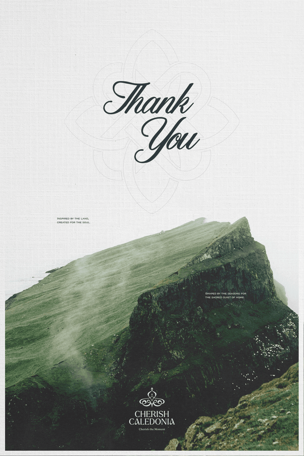
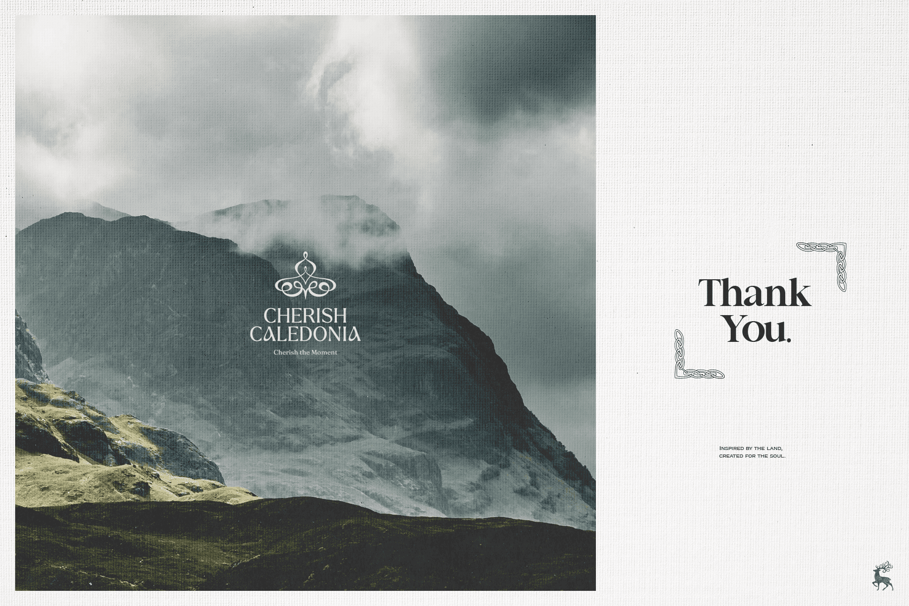
thoughtful and
refined card
We landed on a vertical layout—an unusual format for postcards. The thought process behind this was to go against the regular standard without losing any true functionality. By doing this, the card will also have a chance of being more memorable to the ones receiving it.
We landed on a vertical layout—an unusual format for postcards. The thought process behind this was to go against the regular standard without losing any true functionality. By doing this, the card will also remain more memorable to the ones receiving it.
get in touch

Let’s work together
Nothing kills a great idea worse than bad design—your ideas deserve to shine.

thoughtful and refined card
We landed on a vertical layout—an unusual format for postcards. The thought process behind this was to go against the regular standard without losing any true functionality. By doing this, the card will also remain more memorable to the ones receiving it.
get in touch
Let’s work together.
Nothing kills a great idea worse than bad design—your ideas deserve to shine.