

Echo grounds
The feeling of a coffee shop
As a lover of coffee, and more specifically, going to get coffee, I set out to visualize this feeling. Having coffee is one thing, but the ritual of going to your favorite coffee shop in the morning and just sitting is something different. There are elements around you that all play into the feeling you have. It's the consistent chatter that seems to blend into one sound, it's the background music (if the place has good taste), and it's the sound of beans grinding or milk steaming.
Echo Grounds is a concept brand to replicate this feeling from a visual perspective. The brand focuses on comforting colors, inviting typography and language, and a visual mark that is organic and a natural flow of elements.
A gap in the market
The feeling of
a coffee shop
WaveAid was formed by two lifelong ocean lovers and professional lifeguards with over 18 years of combined experience keeping people safe by the sea. For years, they’ve treated countless scrapes and minor cuts on the beach. After giving the kids boring bandaids, they also gave them a fun sticker. The excitement in their eyes led them to find an opportunity to make healing more fun for kids.
As a lover of coffee, and more specifically, going to get coffee, I set out to visualize this feeling. Having coffee is one thing, but the ritual of going to your favorite coffee shop in the morning and just sitting is something different. There are elements around you that all play into the feeling you have. It's the consistent chatter that seems to blend into one sound, it's the background music (if the place has good taste), and it's the sound of beans grinding or milk steaming.
Echo Grounds is a concept brand to replicate this feeling from a visual perspective. The brand focuses on comforting colors, inviting typography and language, and a visual mark that is organic and a natural flow of elements.
wavaid
Echo grounds

Approachable
and playful
the flow of echo
Taken from the strong visual direction and representation a wave holds, the goal of the icon was to find a unique, abstract way to represent a wave while mixing in other elements. The large rounding lines adds a sotter touch to the typical wave element that contains a sharp peak and aggressive lines. This circular, symmetrical design system also gives room to convey a spiral — a classic symbol of calmness, creativity, regeneration, and growth. Lastly, as a way to tap into the word "aid" and the supportive role lifeguards take, two horizontal lines extend out of each end to form a more concrete, yet subtle, visual of two hands clasping
Taking inspiration from the word "echo," I related this word to all the different sounds that bounce around a coffee shop. A few elements were chosen to stand out from the icon. Firstly, hinting at echo with two identical reflective elements that shape the icon. Second, this in turn shapes the letter "e" as well as hinting at a more abstract coffee bean shape that is not so hit-you-over-the-head obvious. The last element is the organic shape with uneven rounding corners—which nods to latte art when it swirls within the espresso.
the flow of echo
Taking inspiration from the word "echo," I related this word to all the different sounds that bounce around a coffee shop. A few elements were chosen to stand out from the icon. Firstly, hinting at echo with two identical reflective elements that shape the icon. Second, this in turn shapes the letter "e" as well as hinting at a more abstract coffee bean shape that is not so hit-you-over-the-head obvious. The last element is the organic shape with uneven rounding corners—which nods to latte art when it swirls within the espresso.

colors are crucial
In order to justify the personal feeling I receive when inside a small coffee shop, I wanted it to reflect the same for the audience. To do this, the color palette takes direct inspiration from the colors within a latte. The different shades and tints of brown align perfectly with the brand's goals to evoke calmness and a sense of an organic and down-to-earth environment.
playfully dynamic
packaging
colors are crucial
WaveAid came with a clear vision to stand apart from their competitors while simultaneously appealing to kids and their parents. What followed was a set of designs that was full of playful spirit, yet communicating safety and a sense of professionalism to parents who will ultimately be buying the product in stores. All illustrations were custom-made to create a distinct style for the expressions, body-forms, and personality of the sea-life.
Understanding that the adults will see the product on the shelves, it was important to maintain a level of professionalism within all the letterforms and information. All product information should be easy to follow and understand. By achieving this on the outside packaging, this allowed for pure creativity and playful design constructs on the products themselves.
In order to justify the personal feeling I receive when inside a small coffee shop, I wanted it to reflect the same for the audience. To do this, the color palette takes direct inspiration from the colors within a latte. The different shades and tints of brown align perfectly with the brand's goals to evoke calmness and a sense of an organic and down-to-earth environment.

making healing fun
Choosing the right
typography in the logo
Choosing the right
typography in
the logo
The bandaid designs are where the illustrations can fully shine. No information displayed, no concern of shelf appearance. These bandaids are solely to engage the children who come running with a cut or scrape. These playful illustrations and calming color-ways create intrigue for distressed kids.
While trying to feel elevated, but not luxurious, there had to be a balance of roundness and personality. This was found within "Malila" which is a slab-serif font. The slab-serif felt perfect for the brand because of its thicker and organic ends, leaving room to be more rounded than sharp points. This design choice helps the brand feel elevated, while still being inviting and warm.
To balance out the personality in the main font, the supporting font is a simpler sans-serif that is wide to cover the ground that "echo" takes in the logomark.
Choosing the right typography in the logo
While trying to feel elevated, but not luxurious, there had to be a balance of roundness and personality. This was found within "Malila" which is a slab-serif font. The slab-serif felt perfect for the brand because of its thicker and organic ends, leaving room to be more rounded than sharp points. This design choice helps the brand feel elevated, while still being inviting and warm.
To balance out the personality in the main font, the supporting font is a simpler sans-serif that is wide to cover the ground that "echo" takes in the logomark.

making healing
educational
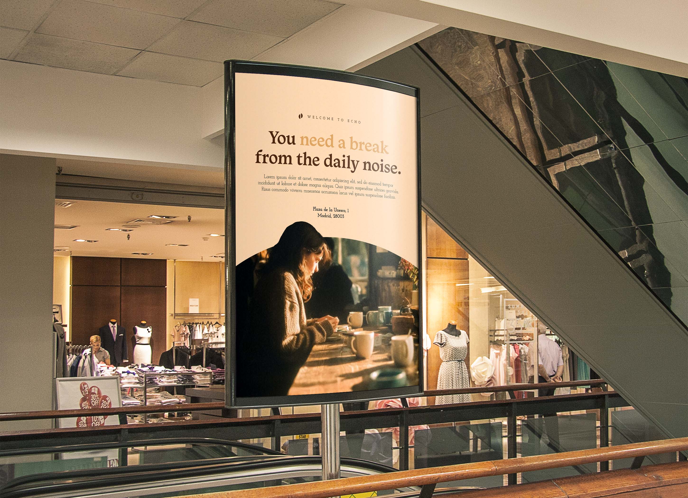
a gravitational pull
One of the ways WaveAid stands apart from other competing brands is by the inclusion of educational fun-fact cards in each box. Each animal has its own card of five facts. This is a key differentiator between WaveAid and other brands. Turning a painful experience for a kid into a fun and educational opportunity for kids.
Through curated imagery and language, signage treatments aim to evoke a sense of place. The goal is to put the viewer inside that cozy coffee shop where you could stay for hours if it weren't for work or other duties
This set of typography is different from the logo to create visual intrigue while achieving the same purpose: to be inviting. The header has playful serifs and rounding, unique corners. On the other hand, the body copy is a slab-serif that plays into the sense of an organic, earthy, and welcoming environment.
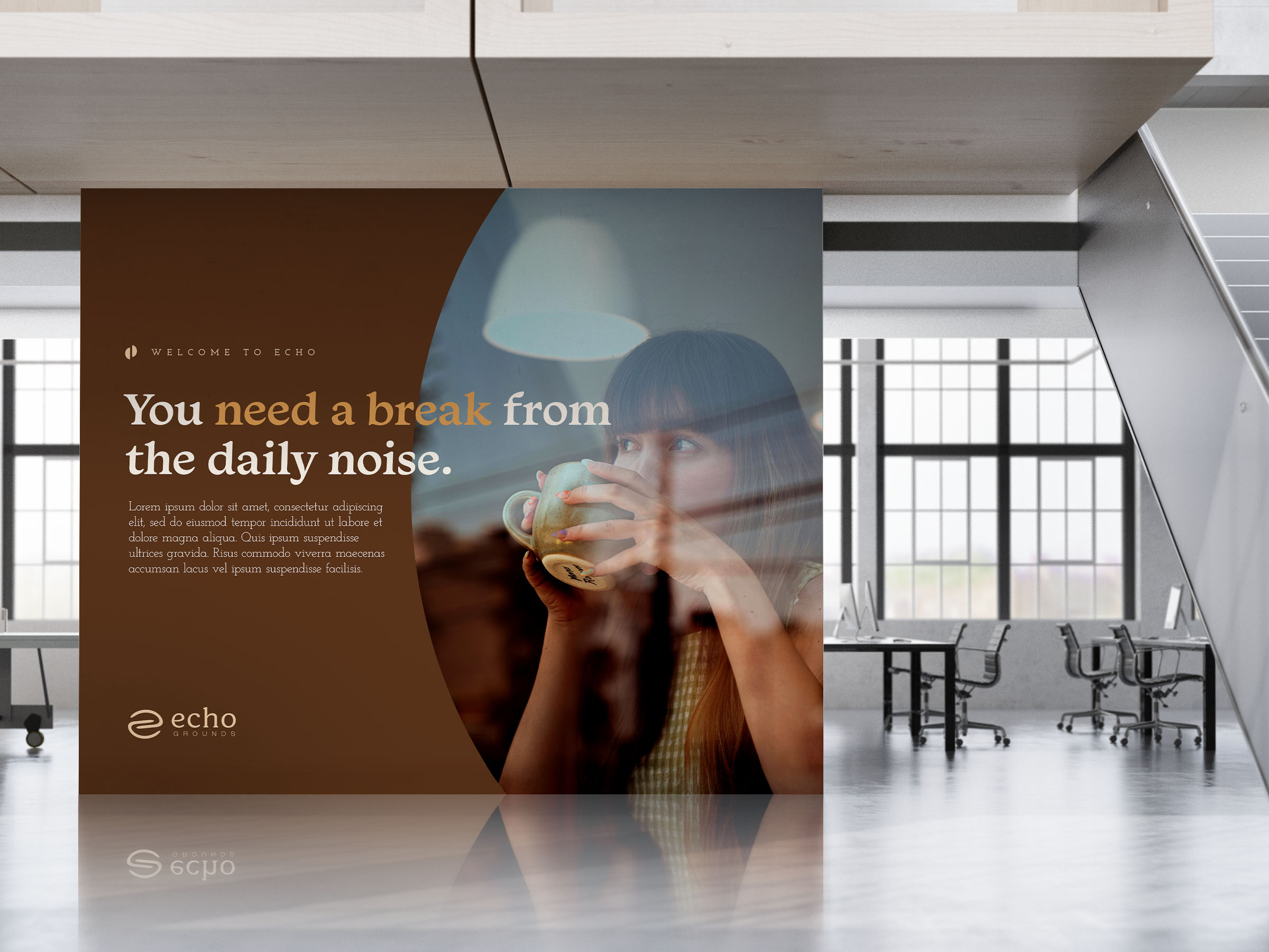
Branding across mediums
Echo Grounds doesn't just appear at the shop or on a sign. The established branding is meant to spread across all collateral to create a cohesive visual presence. From their own specialty roasts, to cups, aprons, and stickers, Echo Grounds is a sense of familiarity from first glance.
Branding across
mediums
Echo Grounds doesn't just appear at the shop or on a sign. The established branding is meant to spread across all collateral to create a cohesive visual presence. From their own specialty roasts, to cups, aprons, and stickers, Echo Grounds is a sense of familiarity from first glance.
get in touch

Let’s work together
Nothing kills a great idea worse than bad design—your ideas deserve to shine.

a gravitational pull
Through curated imagery and language, signage treatments aim to evoke a sense of place. The goal is to put the viewer inside that cozy coffee shop where you could stay for hours if it weren't for work or other duties
This set of typography is different from the logo to create visual intrigue while achieving the same purpose: to be inviting. The header has playful serifs and rounding, unique corners. On the other hand, the body copy is a slab-serif that plays into the sense of an organic, earthy, and welcoming environment.

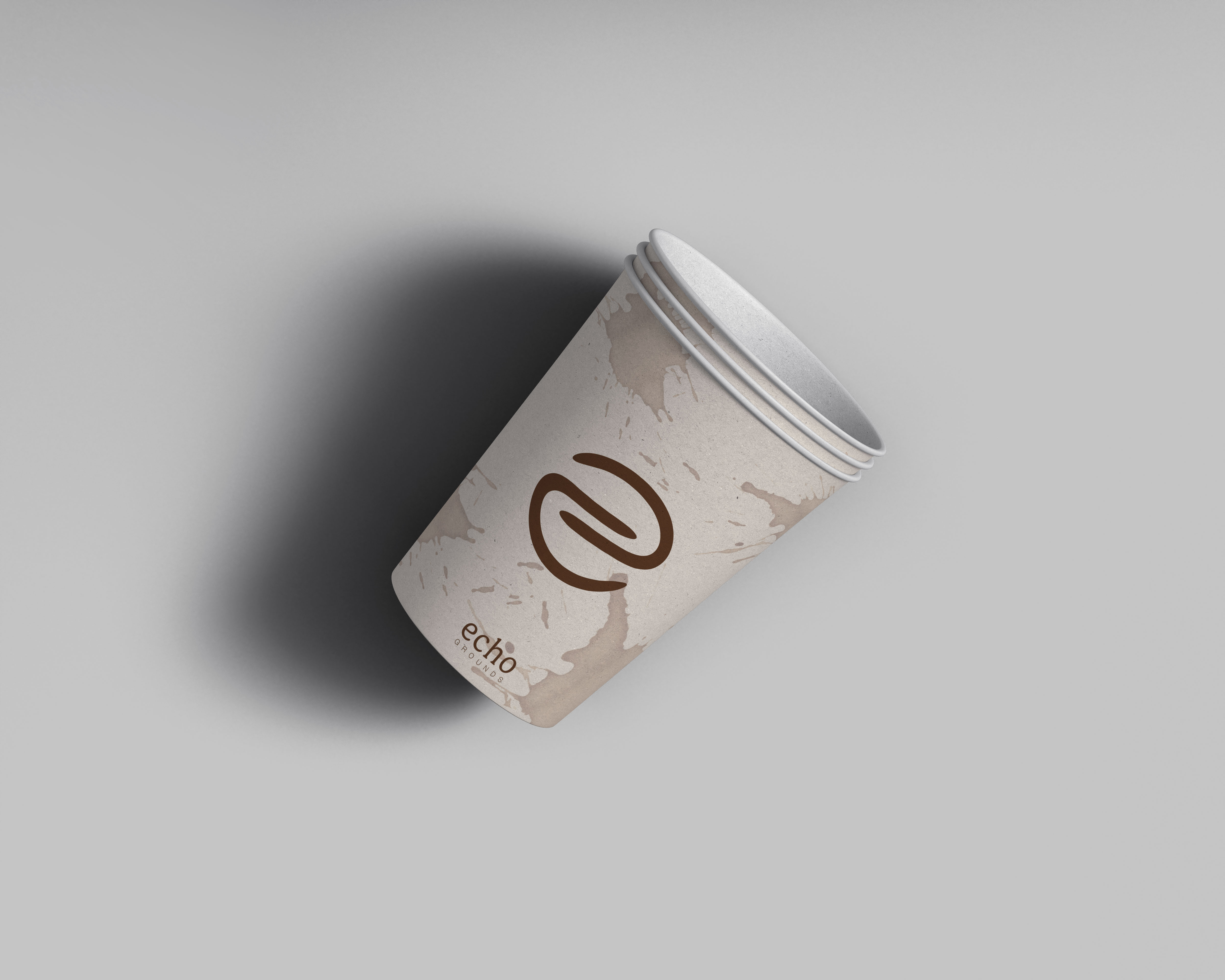

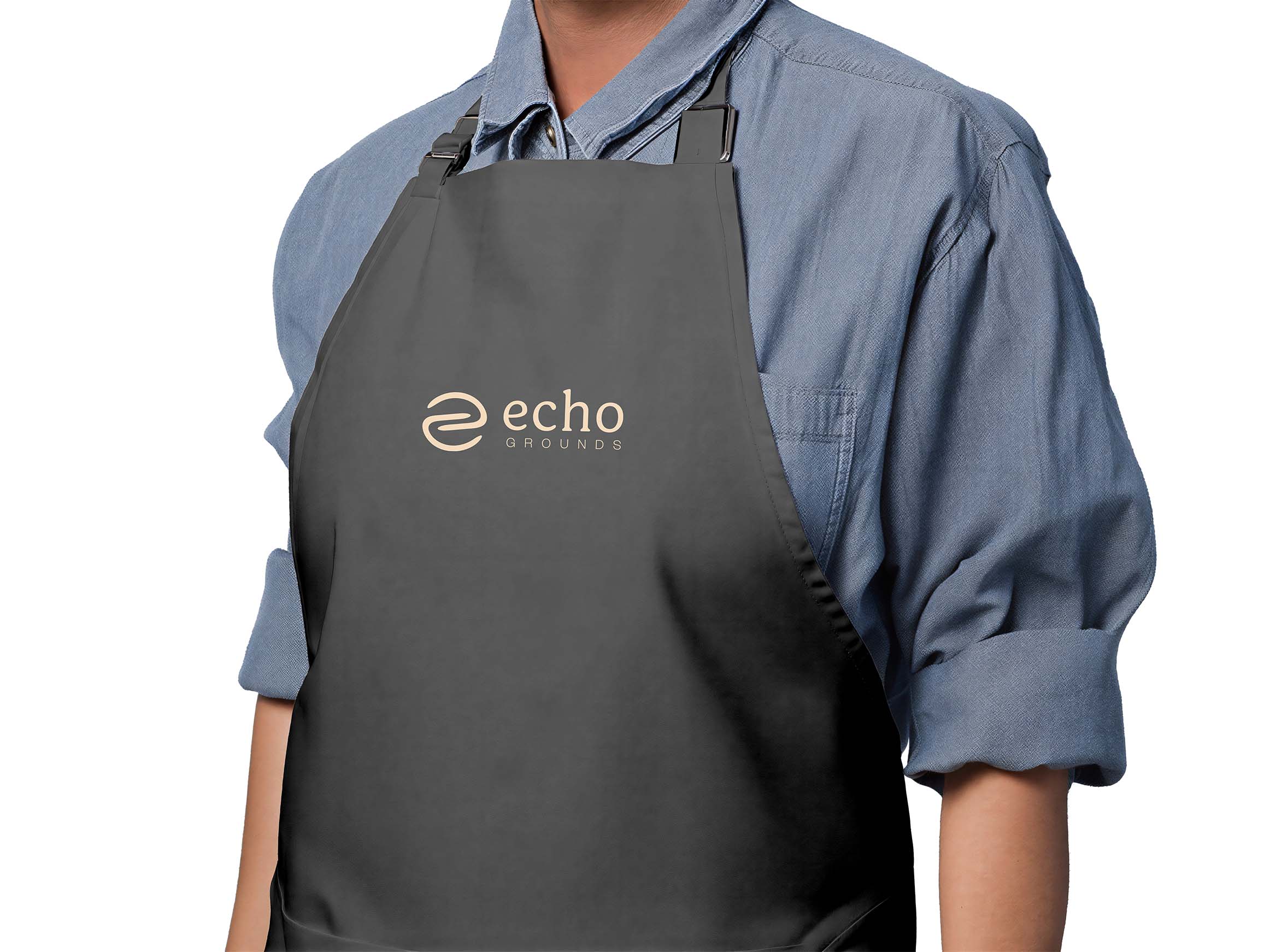
Branding across mediums
Echo Grounds doesn't just appear at the shop or on a sign. The established branding is meant to spread across all collateral to create a cohesive visual presence. From their own specialty roasts, to cups, aprons, and stickers, Echo Grounds is a sense of familiarity from first glance.
get in touch
Let’s work together.
Nothing kills a great idea worse than bad design—your ideas deserve to shine.