

solstice studios
find your highest point with solstice studios
Solstice Studios is a concept brand for a boutique wellness studio centered around balance, mindfulness, and holistic wellbeing. The brand blends calm, modern design with warm, welcoming energy to create a space that feels both elevated and approachable.
Rooted in community and intentional movement, Solstice helps people reconnect with their body and mind through yoga, meditation, and restorative practices. Its identity emphasizes serenity, inclusivity, and personal growth, positioning the studio as both a wellness destination and a daily ritual.
A gap in the market
find your highest
point with
solstice studios
WaveAid was formed by two lifelong ocean lovers and professional lifeguards with over 18 years of combined experience keeping people safe by the sea. For years, they’ve treated countless scrapes and minor cuts on the beach. After giving the kids boring bandaids, they also gave them a fun sticker. The excitement in their eyes led them to find an opportunity to make healing more fun for kids.
Solstice Studios is a concept brand for a boutique wellness studio centered around balance, mindfulness, and holistic wellbeing. The brand blends calm, modern design with warm, welcoming energy to create a space that feels both elevated and approachable.
Rooted in community and intentional movement, Solstice helps people reconnect with their body and mind through yoga, meditation, and restorative practices. Its identity emphasizes serenity, inclusivity, and personal growth, positioning the studio as both a wellness destination and a daily ritual.
wavaid
solstice studios

Approachable
and playful
The solstice
brand sheet
Taken from the strong visual direction and representation a wave holds, the goal of the icon was to find a unique, abstract way to represent a wave while mixing in other elements. The large rounding lines adds a sotter touch to the typical wave element that contains a sharp peak and aggressive lines. This circular, symmetrical design system also gives room to convey a spiral — a classic symbol of calmness, creativity, regeneration, and growth. Lastly, as a way to tap into the word "aid" and the supportive role lifeguards take, two horizontal lines extend out of each end to form a more concrete, yet subtle, visual of two hands clasping
Taking into consideration some branding keywords such as balance, wellbeing, movement, and calm, the logomark has distinct features that hit the mark. The icon plays into balance and soft, thin geomtry to appear welcoming and premium. Playing on the name "solstice," the mark contains four circles that depict how the Earth's position is in relation to the sun. Lastly, the swooping symmetrical lines in the center create a simple body that, if only one circle is present, creates a body in a specific yoga pose.
To appear more premium and elevated, a clean, geometrical sans-serif makes the wordmark "Solstice." This is used for the logo and for header text, while the body text is occupied by a more welcoming slab-serif that has personality. Slab-serifs are known to be more earthy and strikes a fine balance between elegance and playfulness.
The solstice brand sheet
Taking into consideration some branding keywords such as balance, wellbeing, movement, and calm, the logomark has distinct features that hit the mark. The icon plays into balance and soft, thin geomtry to appear welcoming and premium. Playing on the name "solstice," the mark contains four circles that depict how the Earth's position is in relation to the sun. Lastly, the swooping symmetrical lines in the center create a simple body that, if only one circle is present, creates a body in a specific yoga pose.
To appear more premium and elevated, a clean, geometrical sans-serif makes the wordmark "Solstice." This is used for the logo and for header text, while the body text is occupied by a more welcoming slab-serif that has personality. Slab-serifs are known to be more earthy and strikes a fine balance between elegance and playfulness.

editorial direction and curated photography
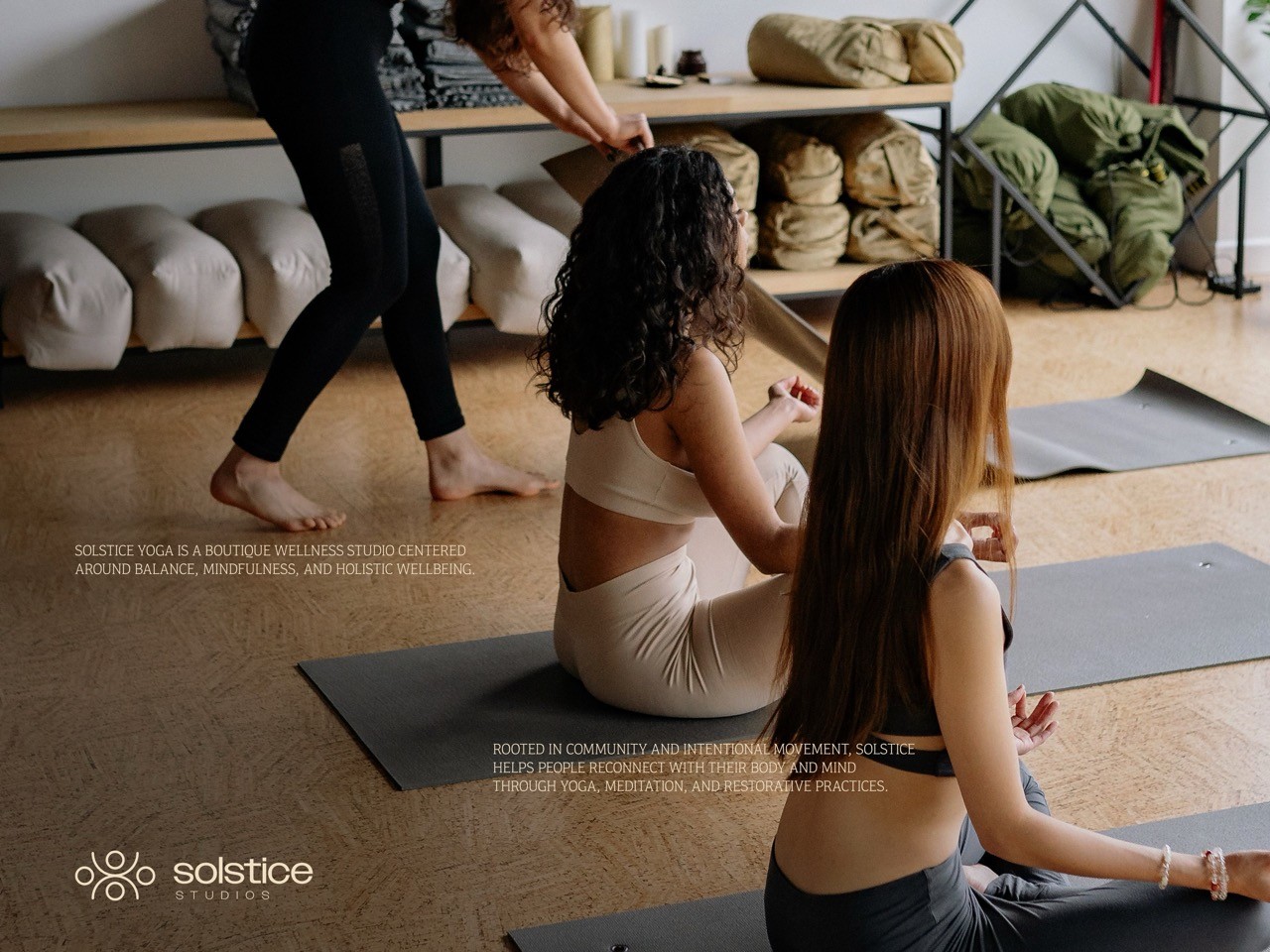
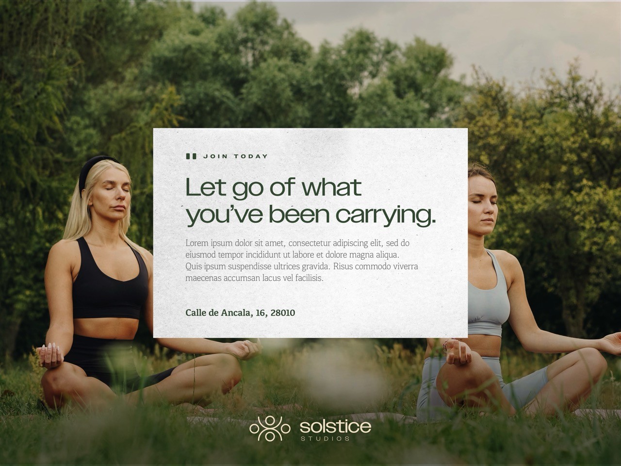
To add a stronger sense of humanity within the visual direction, the typography is treated tastefully with an addition of a script font to create intrigue and is used for impact. The images are carefully curated to communicate the correct messaging of the brand. Slowing down, taking a breath, and reaching your highest point of wellness is at the core of its messaging. To respect this, images that communicate space and openness are utilized. Photos that aren't too crowded and that feel like a breath of fresh air help to create a distinct message unique to Solstice Studios.
playfully dynamic
packaging
editorial direction
and curated
photography
WaveAid came with a clear vision to stand apart from their competitors while simultaneously appealing to kids and their parents. What followed was a set of designs that was full of playful spirit, yet communicating safety and a sense of professionalism to parents who will ultimately be buying the product in stores. All illustrations were custom-made to create a distinct style for the expressions, body-forms, and personality of the sea-life.
Understanding that the adults will see the product on the shelves, it was important to maintain a level of professionalism within all the letterforms and information. All product information should be easy to follow and understand. By achieving this on the outside packaging, this allowed for pure creativity and playful design constructs on the products themselves.
To add a stronger sense of humanity within the visual direction, the typography is treated tastefully with an addition of a script font to create intrigue and is used for impact. The images are carefully curated to communicate the correct messaging of the brand. Slowing down, taking a breath, and reaching your highest point of wellness is at the core of its messaging. To respect this, images that communicate space and openness are utilized. Photos that aren't too crowded and that feel like a breath of fresh air help to create a distinct message unique to Solstice Studios.

making healing fun
analog for
advertisements
The bandaid designs are where the illustrations can fully shine. No information displayed, no concern of shelf appearance. These bandaids are solely to engage the children who come running with a cut or scrape. These playful illustrations and calming color-ways create intrigue for distressed kids.
Marketing material is treated to appear more analog in two ways: typography and image treatment. Typography is spread out, and on occasion depending on context, used more as a decorative piece when the information is secondary to the imagery.
Images are treated with scanner overlays or paper textures to create a sense that the ad can be touched. This design choice is intended to create a balance between feeling premium, yet friendly and inviting. When a company is too clean and pristine, it can sometimes deter an audience. For a yoga studio, the priority is to be grounded and inclusive.
analog for advertisements
Marketing material is treated to appear more analog in two ways: typography and image treatment. Typography is spread out, and on occasion depending on context, used more as a decorative piece when the information is secondary to the imagery.
Images are treated with scanner overlays or paper textures to create a sense that the ad can be touched. This design choice is intended to create a balance between feeling premium, yet friendly and inviting. When a company is too clean and pristine, it can sometimes deter an audience. For a yoga studio, the priority is to be grounded and inclusive.


making healing
educational
solstice across
different mediums
One of the ways WaveAid stands apart from other competing brands is by the inclusion of educational fun-fact cards in each box. Each animal has its own card of five facts. This is a key differentiator between WaveAid and other brands. Turning a painful experience for a kid into a fun and educational opportunity for kids.
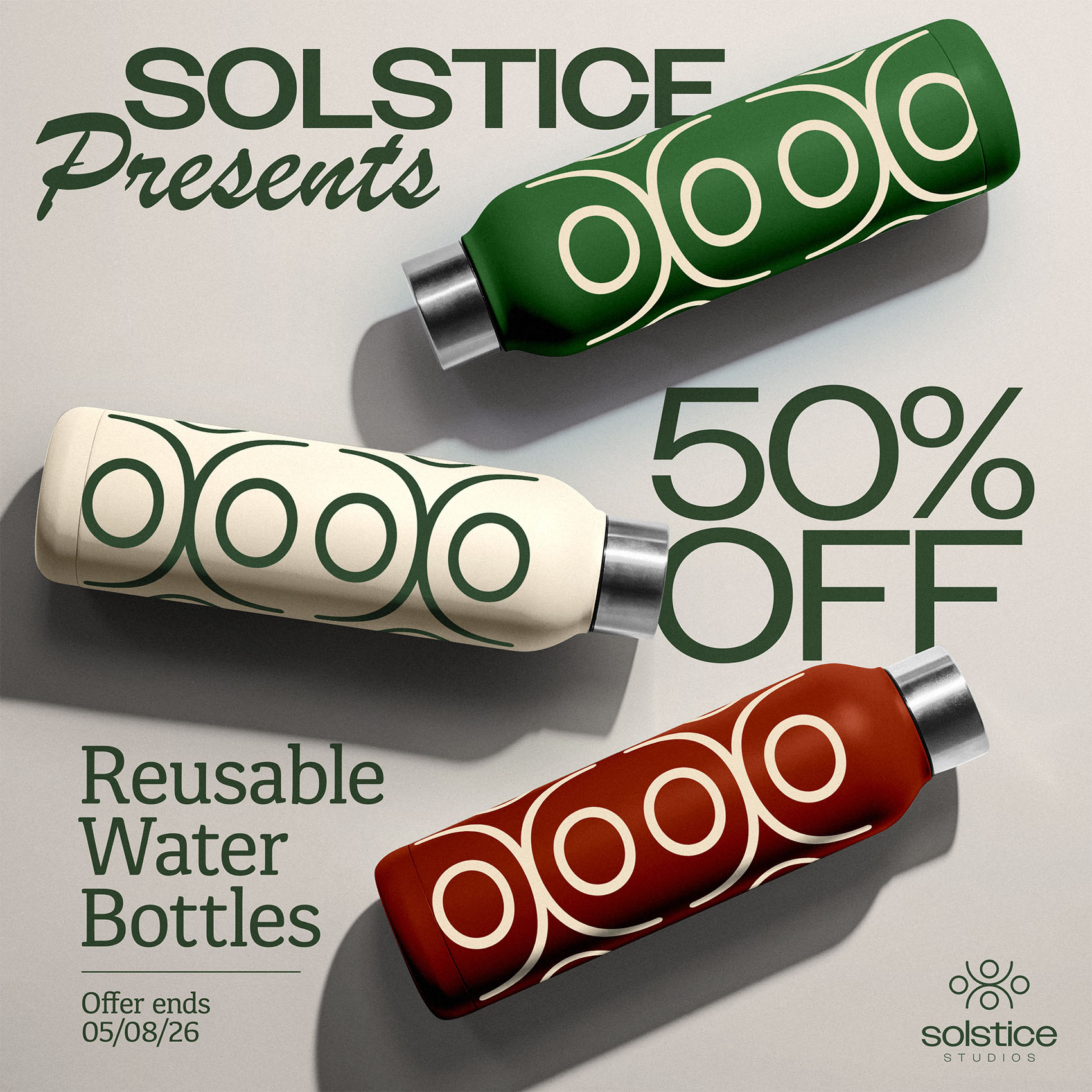
Above is a set of branded explorations of different treatments where the logo, typography, and colors are applied in different contexts. The purpose here is to create a pool of visual communication that feels particularly Solstice. Through the use of consistent headlines, body paragraphs, colors, and the logo and monogram, we are able to create a powerful brand presence across print and digital platforms.
find your point
Solstice is all about balance and movement. The logo was created to be translated into its own set of visual communication. Through this, a static logo creates a dynamic set of images that can scale to communicate different meaning.
find your point
Solstice is all about balance and movement. The logo was created to be translated into its own set of visual communication. Through this, a static logo creates a dynamic set of images that can scale to communicate different meaning.
get in touch

Let’s work together
Nothing kills a great idea worse than bad design—your ideas deserve to shine.
solstice across different mediums
Above is a set of branded explorations of different treatments where the logo, typography, and colors are applied in different contexts. The purpose here is to create a pool of visual communication that feels particularly Solstice. Through the use of consistent headlines, body paragraphs, colors, and the logo and monogram, we are able to create a powerful brand presence across print and digital platforms.
find your point
Solstice is all about balance and movement. The logo was created to be translated into its own set of visual communication. Through this, a static logo creates a dynamic set of images that can scale to communicate different meaning.
get in touch
Let’s work together.
Nothing kills a great idea worse than bad design—your ideas deserve to shine.